Your resume might be packed with experience and achievements—but if it’s cluttered, poorly formatted, or hard to read, recruiters may never get that far. In fact, most hiring managers spend just 6–8 seconds scanning a resume before deciding whether to keep reading or move on.
That’s why smart design and clean formatting are just as important as the content itself. In this post, we’ll walk you through the essential resume design and readability tips from our Resume & LinkedIn Optimization course—so you can make the best possible first impression.
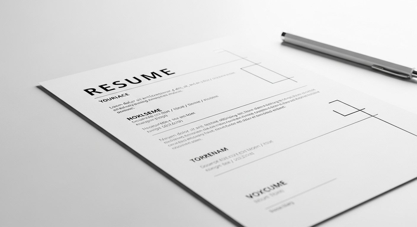
First Impressions Are Visual
Before anyone reads a single word, they’re reacting to how your resume looks. Is it clean, organized, and professional? Or is it busy, inconsistent, and hard to follow?
Here’s what good design communicates immediately:
- ✅ Organized = You look professional
- ✅ Clean = It’s easy to skim
- ✅ No clutter = The focus stays on your value
Your layout isn’t just decoration—it’s a tool to help your achievements shine.
Layout Best Practices: Keep It Clean & Simple
You don’t need flashy templates or design gimmicks to stand out. In fact, the most effective resumes are often the simplest. Use these best practices to get your layout right:
- Use clear section headings like Experience, Skills, and Education
- Stick to 1–2 fonts, such as Calibri, Arial, or Helvetica
- Font size should be 10–12pt for body text; 16–18pt for your name
- Use plenty of white space to avoid a crowded look
- Skip text boxes, graphics, or embedded images—they confuse Applicant Tracking Systems (ATS)
When in doubt, simplify. The goal is clarity, not complexity.
Formatting That Works (and What to Avoid)
Let’s break it down. Here’s a quick checklist of formatting dos and don’ts:
| ✅ Do | ❌ Don’t |
|---|---|
| Use bullet points | Use long paragraphs |
| Left-align content | Center-align job titles or dates |
| Use bold for company names or roles | Use underlines or too many italics |
| Save as PDF (unless told otherwise) | Use colorful templates from Canva or Word |
A polished resume isn’t just more attractive—it’s easier to process, both for humans and machines.
Common Readability Mistakes
Even well-intentioned designs can hurt your chances if they’re hard to follow. Watch out for these common mistakes:
- Dense blocks of text with no breathing room
- Inconsistent spacing or alignment
- Overuse of jargon, acronyms, or buzzwords
- Fancy fonts like script or cursive
- Multi-column templates (these often confuse ATS)
If your resume looks like a brochure or uses more style than substance, it might be working against you.
Test It: Can a Stranger Read It in 6 Seconds?
Here’s a quick exercise to evaluate your resume’s readability:
- Open your resume on screen.
- Show it to a friend or colleague—but only for 6 seconds.
- Ask them:
- What stood out immediately?
- Was it easy to follow?
- Was anything confusing or distracting?
This simple test can reveal a lot about how your resume performs at a glance—just like a recruiter would see it.
Final Takeaways
Resume design isn’t about creativity—it’s about clarity. Here’s what to remember:
- ✅ Keep your layout simple and clean
- ✅ Use structure to guide the reader’s eye
- ✅ Avoid over-formatting and decorative elements
- ✅ Prioritize readability over flashiness
A professional, readable resume helps ensure that your content—your experience, your skills, your results—gets the attention it deserves.
Want More Resume & Career Tips?
This post is just about one lesson from our Resume & LinkedIn Optimization module—part of our complete e-learning series on job search strategies, personal branding, and career development.
Follow our online courses to learn how to build a powerful resume, master LinkedIn, and get interview-ready with confidence. Whether you’re switching careers, reentering the workforce, or leveling up, our courses are designed to help you succeed.
Ready to take the next step? Start learning with us today!
Leave a Reply